COMMISSIONED WORK
QoT | Brand ID
Brasa Publisher
1 Baseball Network | OnAir Look
Ole Interactive | Brand ID
Futura | OnAIr Look
Telecine | Idents
SporTV | Fun Facts
Discovery H&H | Summer
Multishow | VQC 2016
VIVA | OnAir Look
GNT | He for She, UN
GNT | Mother’s Month
PERSONAL PROJECTS
Corumbá, MS
Adrift
Quadrinhos para Barbados
Nosotros Project
About // Contact
Talks // Workshops
Instagram >
LinkedIn >
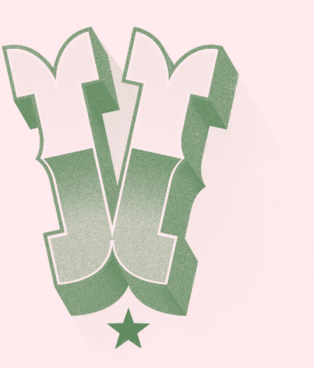
QoT
RebrandingQoT marks a new chapter for @quebrandootabu, one of the largest progressive voices on Brazilian social media. This rebrand, awarded bronze at the Brasil Design Award, brought a visual identity inspired by protest posters, street art and wheatpaste culture, references that echo the brand’s activist DNA.
The color palette, sometimes sober, sometimes bold, mirrors the diverse tone of the editorial line, which ranges from news to entertainment and social issues. Though designed for digital, the system plays with paper-like textures, rough edges and collage elements, bridging the gap between screens and the physical, raw energy of the streets.
The new logotype deconstructs the original name, into QoT, arranged in an unconventional layout that suggests something broken and reassembled. The visual system is flexible, dynamic and clear, delivering information with the same honesty and impact as a protest sign.
Repositioning a brand followed by millions, who grew up alongside its various phases, demanded research, care and a design approach that makes room for evolution. The result is a new identity that feels lighter, more structured and true to its mission: to keep breaking taboos, while pushing back against the culture of cancellation.